
There are 8 methods of creating depth in art, photography and film. In this article, we’ll review each of them in depth, with examples, some pitfalls and suggestions.
While modern technology allows for actual 3D imagery, the fact remains that most outlets for creative work are still two dimensional with the perception of depth created through numerous methods including perspective, shading, aerial depth and the like. This is true for graphics, printed materials, photographs, videos and most films. That said, here are the 8 methods of creating depth:
- Depth by Atmosphere
- Depth by Colour
- Depth by Linear Perspective
- Depth by Light
- Depth by Shadow
- Depth by Solidity
- Depth by Focus
- Depth by Movement (relevant primarily to moving imagery)
Now lets review each one in more detail.
Depth by Atmosphere
This is depth created by atmosphere. That atmosphere decreases visibility of objects that are farther from the viewer/camera.
Here are some examples:

Here you can see that the detail of the background diminishes, with mountains and other objects appearing only as silhouettes . Where there is some colour in the foreground (the rusty platform and hints of warmth in the hangar), there is no colour in the background except a wash of steel blue.

The use of detail and contrast in the foreground compared to the vague shapes in the background is very evident here. As a side note, this is an image created by the awesome Craig Mullins. Look at his gallery at goodbrush.com. He is a master of atmospheric depth.


Atmospheric depth is a great tool when creating matte paintings or any art that needs to show great distance between foreground and background.
Depth by Colour
This is the perception of depth created by colours. Warm colours appear closer to the viewer while cool colours appear farther. The opposite is true against a white background.
Below is the colour depth chart:

The trick with using the colour depth chart is determining whether you are on a black or white background. While there are probably as many theories on this as there are designers, I find the simplest method is to establish what the key colour is of your design (or photograph or scene) and then work back from where you want it—foreground or background. For example, if you are doing a painting of a person, they will usually have warm skin tones. Consequently, the background should be cool. On the other hand, if you are doing a painting of a glass of water (which would usually be blue) you may want your background to go warmer.
Also, you don’t need to use the full range of colours in your design. Using three (or even just two) of the colours can make for a more coherent image. For example, a sci fi image using mostly blue colours could create depth by simply having foreground elements be a more blue-green while background elements tend toward a purple-blue.
Here are some examples of colour depth against a black background (to be fair, this is the most common):


And here are some examples of colour depth on a white background:

(Side note, this is an image from the incredible Daniel Dociu who I had the privilege to work with.)


Depth by Linear Perspective
This is usually the first depth perspective we learn in any art class. In reality, this is what we usually refer to as “perspective.” It is the illusion of objects moving away from the viewer through lines which converge to an infinite point. If you look down some rail tracks you will notice that, although in reality the tracks run parallel, the way you perceive them is that they become closer and closer to each other as they move away from you. This is also the reason the Sun (millions of times the size of Earth) looks like the size of a small coin.
Here you can see perspective lines overlaid on top of a photograph:

And here are some examples of images that use linear perspective quite obviously:


Depth by Light
This is simply the perception of depth created by light. Any shaded image has this, with highlights indicating surfaces that are closer to or facing the light source in the scene. In ambient lighting conditions, where the scene is being lit by the sky, something closer to the viewer will be darker whereas farther objects will be lighter.
Below you can see an image with some basic shapes and no depth. This same image is shown on the right with only light added to it. Immediately there is depth.

Here are some more examples that showcase the use of light to create depth:


Depth by Shadow
This is the perception of depth created by light as shadows. This is the opposite side of the coin to light and is evident in any shaded image. Those areas which are facing away from the light source are drawn in with shadows.
This could also simply be called Depth by Shadow.
Here you can see the same example—an image with some basic shapes followed by the same image with only light as shadow added to it.

And for the sake of following through with our example, here is that same image with the light and shadows combined:

And here are some more examples of creating depth by shadow:


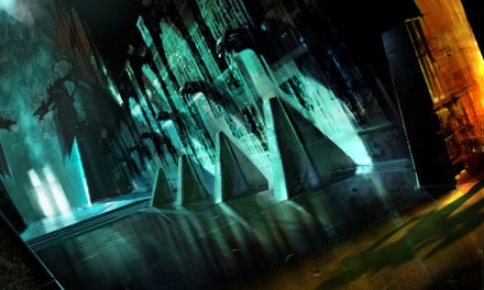
Depth by Solidity
This is a from of depth perception used primarily in drawing and painting, where distant objects are rendered with less solidity while foreground objects are drawn with more solidity. This is extremely common in any classic cartoon, where the background is rendered less solid than the foreground.
Here are some examples:


Depth by Focus
Also called focal depth and sometimes incorrectly called Depth of Field (DOF). This is where items closer to the viewer are sharp while farther objects are sharp/in focus.This can be inversed as well, with near objects being blurry and further objects being in focus.
Here are some examples of using depth by focus:


Depth by Movement
This is the perception of depth by movement. This is commonly observed when on a moving object (such as a train), wherein objects that are close move by quickly and objects that are far away (such as mountains) move by slowly.
Because this depth perception relies on movement, it is primarily used in moving footage, however can be implied in an image through the use of motion blur in foreground and/or background elements.

Summary
A designer should be familiar with every one of these depth perspectives. Most inherently are as they are the way in which we view the world. Colour depth and aerial perspective are probably the ones most overlooked by artists and designers. So my suggestion is to get a good grasp of those two while keeping the others in mind.
The creation of depth is critical to any art. Hopefully this helps you in yours.


Really great article. Thanks for taking the time to explain things in such great detail in a way that is easy to understand.
Thank you for this article. Great info and great examples.
I’m doing a large painting that is more complex than I like, and your comprehensive article has helped me stand back and consider each of these elements of depth, individually. The examples you have chosen are great for me. Thanks
Really glad to hear this!
Very good article.
My teacher mentioned this page?so I visite, and many of my classmates should also visit.
Thank you!
– from distant China
you forgot DEPTH by parallax and binocular disparity
Thank you so much to share this article, is very very useful for me, thanks again. 🙂
Great article – thanks.
In the summary you mention ‘colour and aerial perspective’ but I don’t see aerial perspective in the piece. Is that meant to be synonymous with linear perspective or is their an unmentioned ninth method?
Thanks again.
Aerial perspective would be synonymous with atmospheric perspective/depth.
Very useful but i think you should give credits to the artist.
Agreed! When I have time, I’ll go through and see if I can find the original artists on these.
Great site! Thank-you
Very good write-up. I absolutely appreciate this website.
Thanks!
This is a great blog. It really helped me understand, fully, colour depth and how to use it in my work as a director. Thank you!
Very helpful in designing a shot. “Depth” is often overlooked altogether.
Great article. The examples are very ‘illustrative’ to your description. Excellent artists.
Wery interesting. I learn much with this blog. Thank you very much. R. G.
Keep on writing, great job!
Great job!
Interesting and very helpful article. Thanks for sharing it with us!
Very informative and interesting. Thanks for sharing. Most of the examples make sense but never thought about using movement!
Thanks for the awesome tutorial!
Really good website, this helped me a lot in my art lesson